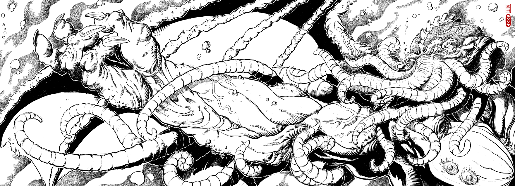
The Dreamer Awakes
Ballpoint and brushpen on copy paper. 797mm × 289mm.
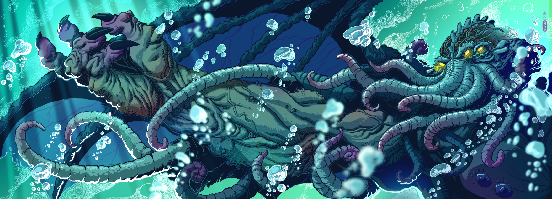
A just-for-fun piece. I completed the ink drawing over six lunch breaks at my day job, then scanned it and coloured it digitally over around six evenings at home.

A few initial stages of progress on this piece. 1. I scan the ink drawing, which was on two pieces of A3 copy paper. The scanner warps a little at the join, so there's some manual reconnecting of lines using the pen tool in Clip Studio Paint, on the G-pen preset. 2. I lay in basic flat colour areas to consolidate the main masses and shape relationships, again using the pen and eraser tools. 3. I begin sculpting out some form detail in the hand. This is still with the pen and eraser tools. At this stage, I use the gradient tool to throw some hue variation across certain areas of the skin. I'm also constantly changing the hue of the background—this activity will continue right up until the final stages of development. 4. Further detail in the form, trying to communicate the masses accurately while following what the ink work is suggesting.
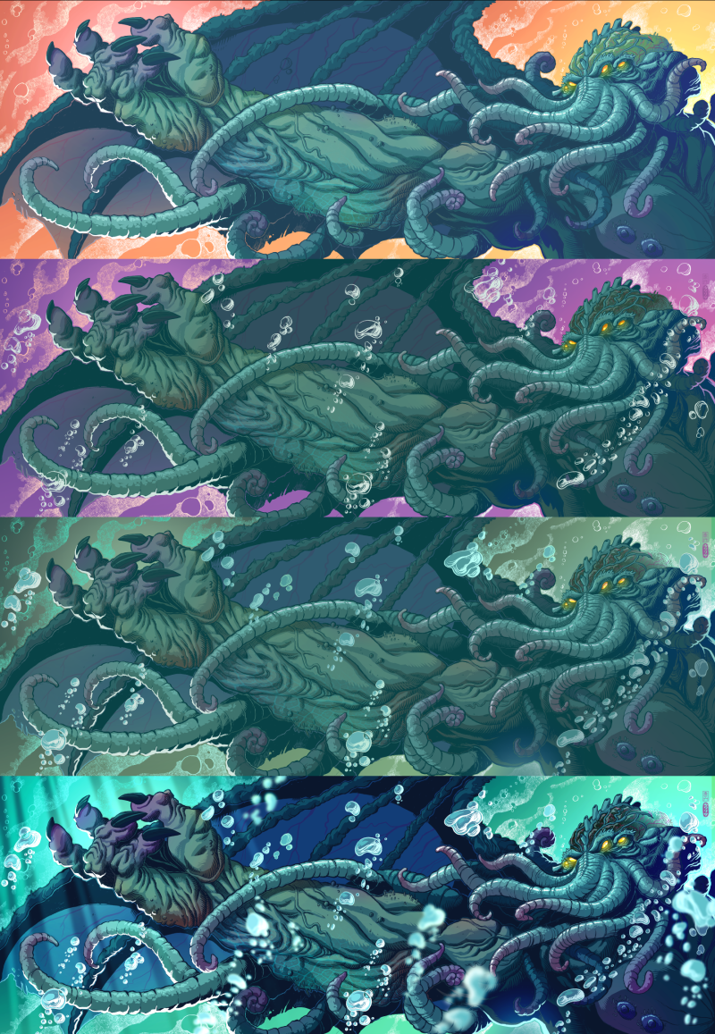
5. The character doesn’t have a lot of colour variation, so I use the radial gradient tool to pick out some extremities to receive some fleshy ruddiness. I liked the ink rendering of the hand, but I feel as though it’s getting lost in the colouring stage, so I hit it with some rim light to get it popping more. I feel the need to do something more interesting with the cranium area, so I start by lightening it, adding some veins, and some glossy-ish reflections. 6. The whole image is lacking a bit of dynamism at this point, so I literally go back to the drawing board and do up some bubble clusters, which I then scan, chop up, and place around the character. I’m aiming to sell the idea that he’s underwater a bit more convincingly. The cranium needs to be darker but it’s still not pleasing me yet. And we have yet another change of background hue. 7. The bubbles are doing what I hoped they would, but I’m still missing some of the shallow depth of field I try to use in all my stuff to give that spatial illusion. I’m also leaning towards a more monochromatic atmosphere for the entire piece—going complementary with the background was feeling kind of cheesy and heavy-handed. This khaki colour isn’t quite right, but it’s a start. 8. I copy some of my bubbles, reconstitute them a little with the mesh transform tool, scale them up, then obliterate them with a fairly aggressive gaussian blur. I add some god rays to the left using the polyline marquee and foreground-to-transparent radial gradient on an overlay layer. The saturated green I was using earlier on in the process feels like a good bet to give the eerie feeling that I’m chasing. I reckon we’re pretty close, so I flatten the layers and start on the tonal corrections. I mainly just up the contrast and tweak the colour balance on all three modes: shadows, mid-tones, and highlights.